How We Used Spot Trender To Test Our New Explainer Video
“Be a user of your own product.”
Evan Williams, Cofounder @Twitter
Have you ever felt so frustrated with long meetings in which everyone gives their opinion on how to improve an ad or marketing materials but didn’t have enough data to back up their gut feelings? That frustration was why we started Spot Trender.
We eat our own dog food at Spot Trender. Recently, we made a video explainer to help explain our products and services to new clients. Our team had mixed feelings about the first version, so we decided to use Spot Trender to help make the best decision. We eat our own dog food!
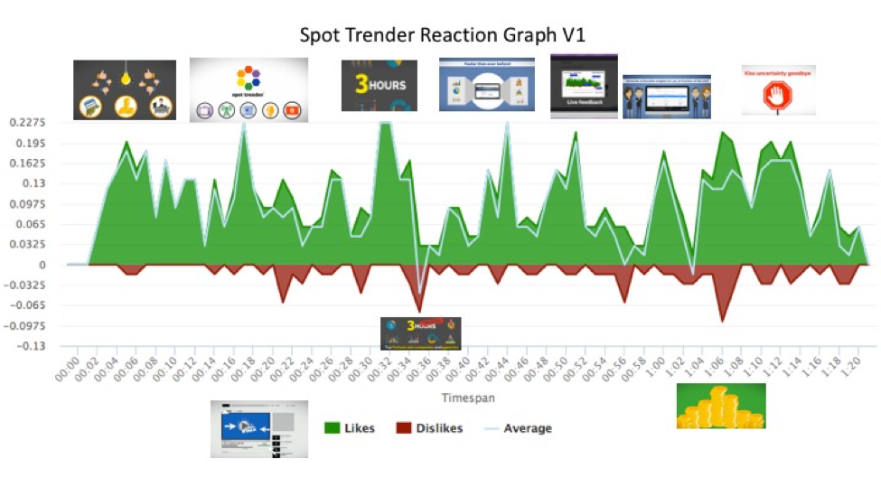
Here’s version 1 of the video:
When we got the test results back, here’s the process we used to generate actionable insights:
- Quantitative comparison:
To benchmark, we compared our video against competitors & the general industry norm. While most of our key metrics were high, our likelihood to act (sign up or email us for more information) was just about average. Product and brand perception metrics were encouraging, but “Spot Trender lets you run more tests” were low. Based on the data, we decided that we need to improve the spot. To step 2!
- Correlate reaction graphs with actual scenes:
The reaction graph was mostly positive; however, it dipped low at 3 points: at 00:21, 00:34, and 01:06.
- Analyze live comments to make sense of reaction graphs:
When we correlated the scenes to the reaction graphs, we isolated and identified 3 “problem segments,” listed below. Then, we combed through the live comments to identified why the audience didn’t like them.
- Problem Segment 1: Stop waiting weeks for results (around 21s)
- Live Comment: “Too much on the screen” 21s
- Analysis: The arrows were moving too fast and distracted viewers from one of our key messages.
- Problem Segment 2: Used by Top Fortune 500 companies and agencies (33s)
- Live Comment: “This is for bigger companies than mine, but I like it.” 36s
- Analysis: Participants who offered similar comments listed themselves as small business owners.
- Problem Segment 3: With the same budget, you can test more
- Live Comment: “The pile of gold is distracting and looks juvenile!” 1min 4s
- Analysis: The pile of gold is a flop!
- Act!
Based on the quant and quals from the test, below are some the of changes we made to the video:
- Use more professional, stable graphics for problem segment 1.
- Since this explainer’s primary audience is our enterprise clients and ad agencies, we left problem segment 2 alone.
- We change the pile of gold graphics in problem segment 3.
- Adjust the music to voice volume since many participants complained that the music was too loud in the Live Comments.
- Add Reason to Contact at the end of the video to improve the likelihood to act.
Here’s version 2 of the video:
If you’re curious about what our survey looked like, you can give us feedback on Version 2!