How to Prevent PR Nightmares with Effective Ad Testing
We’ve all had this nightmare. You created a concept that everyone in your team thinks it’s “revolutionary” and “it’s going to be the next Apple’s 1984 ad!” You are the office hero. You feel 100% confident, and the spot went to production without a hitch. Your company spends millions blasting it out on all channels. Then it happens…
First, it starts on social media, with tweets by people who hated your spot. It surprises you because you thought it was taken out of context, and you meant well. Then the bloggers pick it up. Then influencers start to tweet about it. The storm is building… Next thing you know, major media outlets pick up the story, and your company has to go to damage control mode.
The good news is you can minimize the risk of PR nightmares—if not avoid it entirely with effective ad testing.
Let’s look at how:
1. Create an Early Warning System with questions around the brand, likability, and social share.
Some of our favorite questions to ask are:
Did you like the ad you just saw? [Likert scale: liked it very much – disliked it very much]
Overall, how did this ad affect your opinion of the product/service mentioned? [Likert scale: like it a lot more – dislike it a lot more]
Would you agree with the following statement:
“This ad is offensive” [Likert scale: strongly agree – strongly disagree]
Potentially offensive ads have low likability, brand opinion, and high agreement on “this ad is offensive.”
2. Look at reaction graphs to spot the potentially offensive segments.
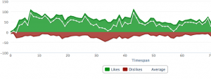
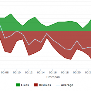
What are the reaction graphs? Spot Trender reaction graphs measure your audience’s reaction to your spot as they watch your commercial with reaction graphs. As your target audience watches the video, they click the up or down arrow button on the keyboard to indicate whether they like or dislike a section.
For example:

Assume you’re looking at a spot about a vacuum cleaner. When you look at this reaction graph, you can see potential trouble segments around 18s, 33s, and 58s. In this example, you would pay special attention to 33s since it has the strongest negative dip. Note the elements in those segments, such as what’s being said, music, and new scenes.
3. Cross check quantitative data with verbatims (qualitative).
Now that you’ve identified the trouble spots, refer to your verbatims to figure out what people didn’t like about them. Look through the answers and correlate elements participants didn’t like with the negative dips in the videos.
Continue from the example reaction graph above, for “What didn’t you like about the ad?”, 21 participants mentioned they didn’t like the joke about marriage, which was used in the middle of the spot (33s). You can now filter those participants out by demographics to see what they have in common. With this data, you can get a general idea of who might be offended by your spot and take steps to avoid it. For instance, you might find out that conservative females in the Mid West are offended by the joke about marriage. You can either cut it out entirely or change it slightly to be less risqué.
Are you working on a spot and curious about how people would react to your ad? Your current running spot didn’t perform as you expected? Or you’re looking for peace of mind? Contact Spot Trender—we would be happy to help to take your spots to the next level. Contact us today.


