Use Reaction Graphs to Optimize Ad Performance
Every advertiser wants their audience to have a positive reaction to their ad. That’s why it is crucial to test for audience reactions early on in the creative process. Survey responses only tell you some of the stories. They’re a great way of measuring likeability, believability, and other actionable insights, but what does your sample think of the ad itself in real-time as they watch? The answers are in the Spot Trender Reaction Graphs.
With reaction, graphs you can evaluate the performance of your spots in real-time. Reaction graphs are easy to implement with Spot Trender. When it comes time for the survey respondent to watch the video, they can enter any comments that come to mind. Their comments will be used to generate reaction graphs on our platform. For example, let’s look at a set of reaction graphs from one of our tests, Bush vs. Underwood vs. Rubio.
From the reaction graphs, we can see clear spikes and dips in interest. The green portion represents positive reactions, and the red represents negative reactions. This provides an intuitive and visual way to compare spots against each other, both quantitatively and qualitatively. We can see a breakdown of reactions, including live comments from participants. The commentary gives specific insight as to why any large peaks, negative or positive, are occurring. You’ll know, specifically, which elements of the spot are a hit or miss based on the real-time reactions.
Marco Rubio Campaign Spot
Jeb Bush Campaign Spot
Frank Underwood Campaign Spot
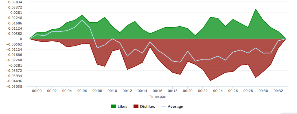
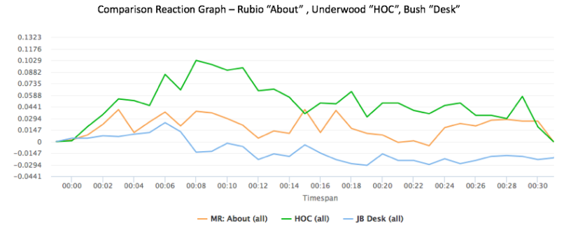
Take Jeb Bush’s campaign ad for example. This reaction graph had an overwhelmingly negative response. The negative dips are most severe when his opponents are slammed for issues surrounding national security, yet the biggest dip of all is when Jeb Bush appears on the screen at the end of the ad. These huge negative dips demonstrated that the way this attack ad presented the issues that were unpopular with voters. The real-time comments further express such sentiments.
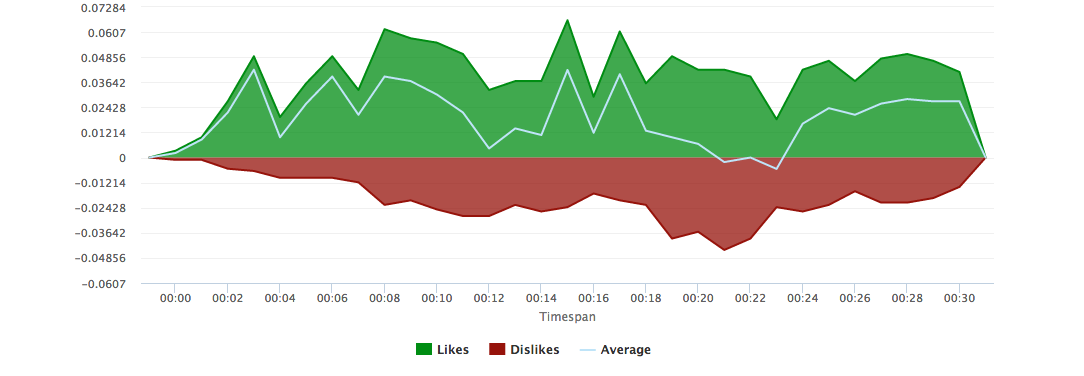
Marco Rubio’s ad had large spikes in both negative and positive directions. Overall, this ad garnered more positive reactions than Jeb Bush’s. He starts strong, with a large spike at the beginning when he first appears on the screen, and further spikes in interest when talking about traditional values and the economy. However, a dip occurs when he discusses national security. This ad clearly performed well overall, but not as well as the winning spot.
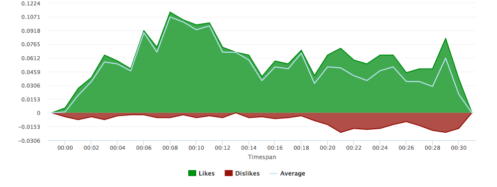
The winning spot was Frank Underwood’s ad, a fictional character from the television series, House of Cards. The reaction graph is overwhelmingly positive. There were high spikes in the positive direction from the imagery of American landscapes, children, and patriotism, and especially the Character of Frank Underwood himself. Here we can see how all three spots compare against each other.
This process can be replicated for virtually any ad campaign. Wondering how you can incorporate reaction graphs into your ad testing game plan? Spot Trender can help you make positive changes to your brand’s ads. Spot Trender is a full-service ad testing company—we help our clients test their concepts/storyboards all the way to post-produced spots. Contact us now. We’ll work with you to craft powerful messages.


